When Nintendo launched the Nintendo 64 in 1996, it marked a turning point for the industry, introducing players to fully realized 3D environments and redefining console gaming. Titles like Super Mario 64 and The Legend of Zelda: Ocarina of Time went on to become timeless classics. However, new insights from a former designer reveal that the console almost launched under a completely different identity: Ultra 64.
In a recent interview with Creative Review, former Nintendo branding partner Tim Girvin revealed that the Nintendo 64 nearly launched as “Ultra 64” with a radically different visual identity before the company opted for a globally unified branding strategy.
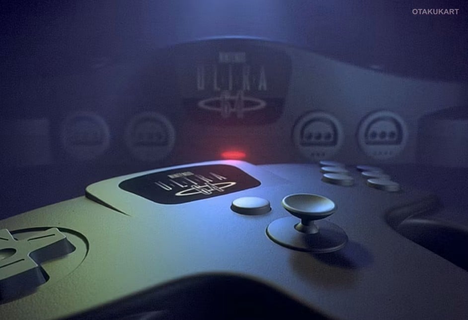
A Different Vision for Nintendo’s Next-Gen Console
Before the final branding decision was made, Nintendo of America commissioned Girvin’s agency to develop a full visual system for the console during its “Ultra 64” phase. Unlike the playful and colorful identity the Nintendo 64 is known for today, the Ultra 64 concept focused on a more advanced and technology-driven aesthetic.
Girvin explained that his team aimed to emphasize innovation and the console’s technical leap.
“Our strategy was to look at dramatic ways to play to the technological sophistication [of the console], and a distinctly different approach to product branding,”
he said.
The branding went far beyond a logo. It included packaging, merchandising, and a cohesive design language intended to stand out in increasingly competitive retail spaces dominated by companies like Sega and Sony.
Girvin’s involvement with Nintendo dates back to the late 1980s, when the company was still building its identity in North America. Over time, his agency contributed to packaging and branding across multiple systems, including the Nintendo Entertainment System and Super Nintendo.
His approach focused on consistency and hierarchy, ensuring that products communicated clearly to consumers on store shelves.
“There was an overarching Nintendo system… then individual hardware systems and categories,”
Girvin recalled, describing a layered strategy that helped organize Nintendo’s growing ecosystem.
This experience shaped the Ultra 64 concept, which was designed as a natural evolution of Nintendo’s earlier branding efforts.
Despite early momentum, the Ultra 64 branding was ultimately abandoned just months before the console’s release. Nintendo chose to move in a different direction, opting for a simpler and more globally unified name: Nintendo 64.
Girvin acknowledged the shift but maintained confidence in his team’s work.
“We lost,” he said. “But I still think our design system was better”.
The decision was reportedly influenced by the company’s desire for consistent global branding. There were also concerns about naming conflicts and long-term scalability, especially as Nintendo expanded its presence worldwide.