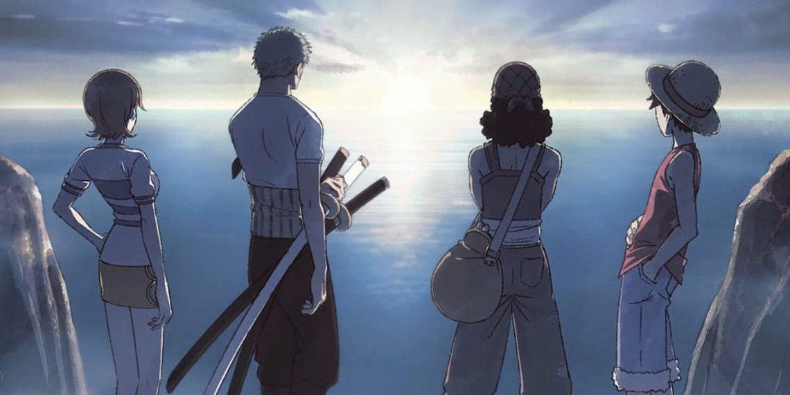
On August 11, 2024, Wit Studio, known for its exceptional work in the anime industry, revealed the highly anticipated character designs for the “One Piece” remake.
This revelation was made through a detailed production preview video, offering fans scenes into the creative process behind the remake.
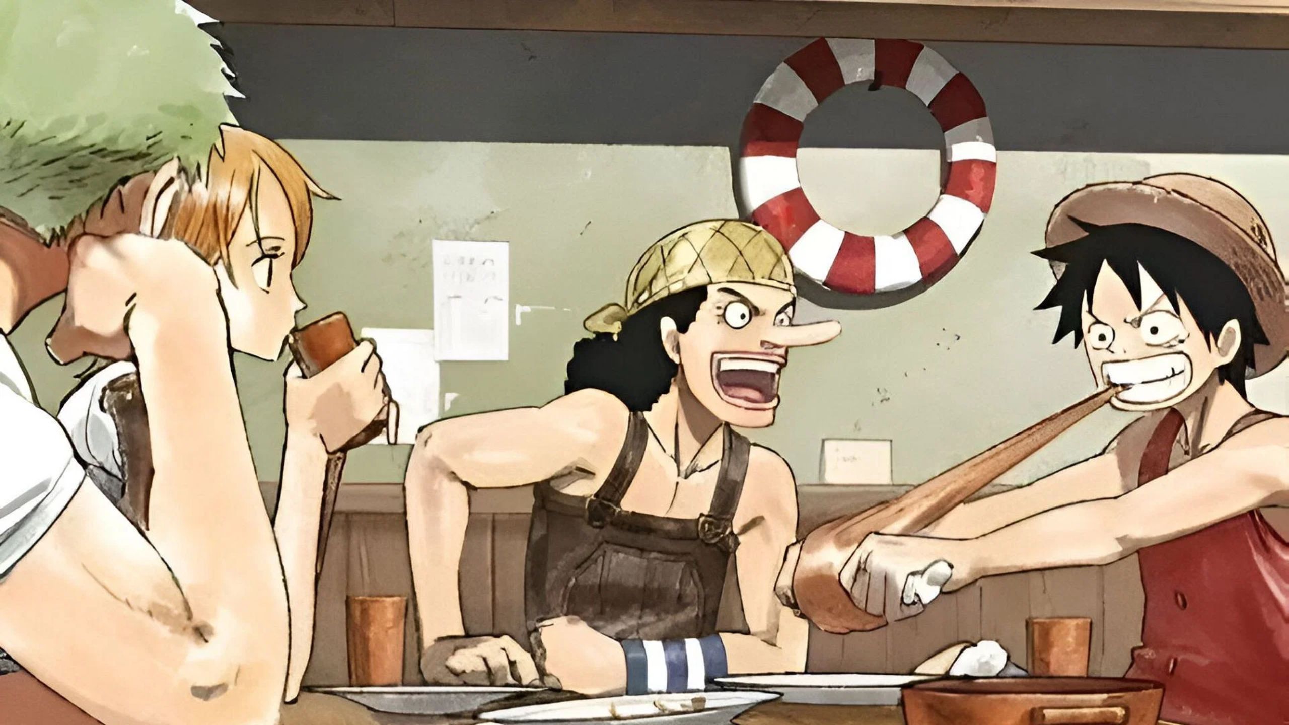
The video not only showcased the talent involved but also the passion and dedication that the studio is pouring into this ambitious project.
The character designs were created by some of the most seasoned animators in the industry, whose expertise is evident in the intricate sketches that were shared.
The announcement generated significant excitement and curiosity, particularly regarding how these new designs would compare to the original anime adaptation by Toei Animation.
While both studios have their distinct styles and approaches, Wit Studio’s version appears to have taken a fresh perspective on the beloved characters while maintaining a deep respect for Eiichiro Oda’s original vision.
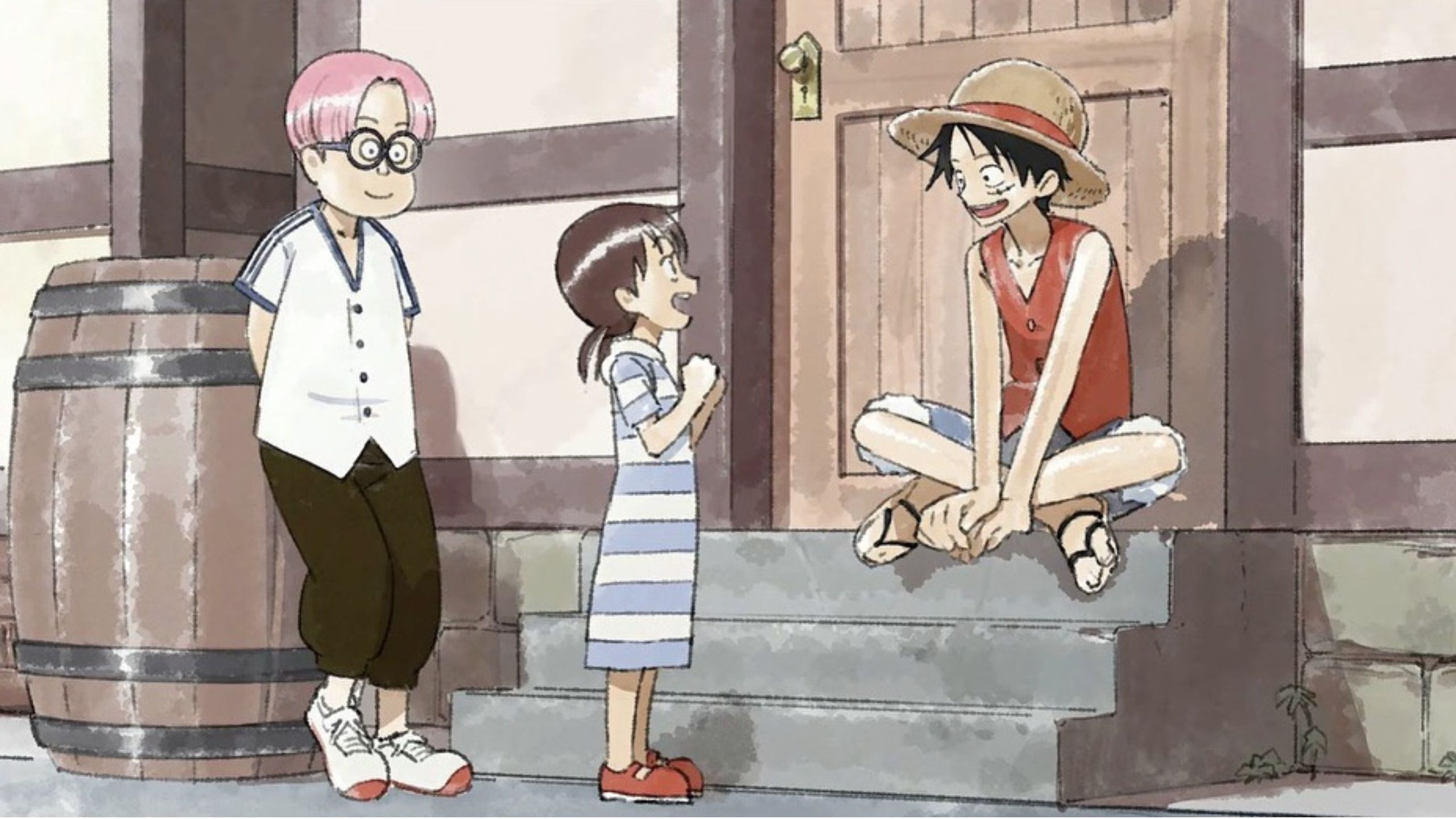
This article delves into the differences between the character designs by Wit Studio and Toei Animation, exploring how these changes might influence the viewer’s experience.
Wit Studio’s Unique Touch: A Softer, Brighter Palette
One of the most noticeable differences in the remake’s character designs is the use of a softer, brighter color palette.
Wit Studio has a reputation for employing smooth, almost ethereal color schemes in their work, which contrasts with the more vibrant and dynamic hues typically seen in Toei Animation’s original “One Piece” anime.
This change in color tone gives the characters a lighter, more refined appearance, which some fans may find refreshing.
For example, Roronoa Zoro’s design in the remake appears noticeably brighter.
This subtle change could be interpreted as an attempt to reflect Zoro’s evolving role within the Straw Hat crew, emphasizing his increasing prominence and strength.
The softer colors might also serve to highlight the nuances of his character that were perhaps less apparent in the original adaptation.
Similarly, Nami’s design in the remake has taken on a more feminine quality. Wit Studio has subtly enhanced her facial features, giving her a softer, more delicate appearance.
This change has been met with mixed reactions from the fanbase. Some fans appreciate the more elegant portrayal, which they feel aligns with Nami’s cunning and intelligence, while others miss the slightly edgier look from Toei’s version.
The Minds Behind the Magic: Takatoshi Honda and Kyoji Asano
The driving force behind these new designs are two industry veterans: Takatoshi Honda and Kyoji Asano.
Honda, known for his work on “To Your Eternity” and “‘In/Spectre”, brings a wealth of experience in creating emotionally resonant and visually attracting character designs.
Asano, with a portfolio that includes “Attack on Titan”, “Spy x Family”‘, and “Guilty Crown”, is celebrated for his ability to capture the essence of a character while adding his unique stylistic flair.
Asano’s involvement in the “One Piece” remake has been particularly intriguing.
He revealed that his initial designs for the characters were “very different” from the originals, which led to some criticism and the need for revisions.
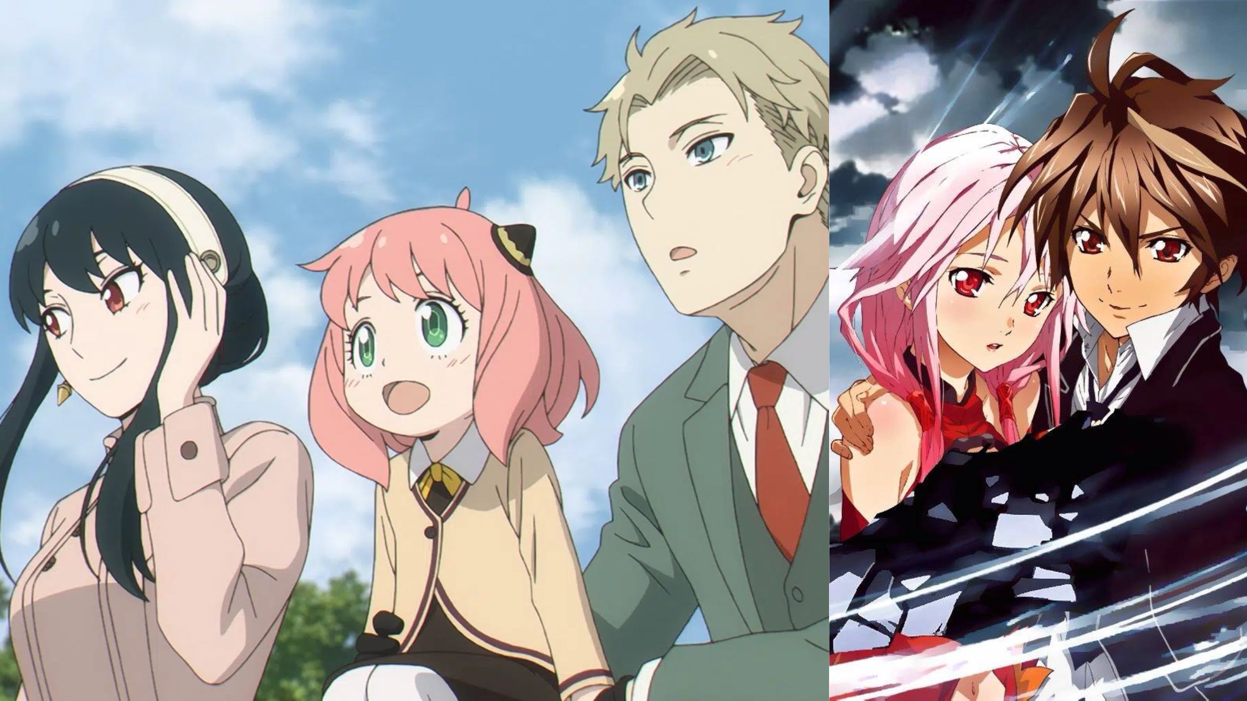
This insight into the creative process highlights the challenges of reimagining such iconic characters.
The goal was not to reinvent the wheel but to offer a fresh take that honors the original designs while infusing them with Wit Studio’s distinctive style.
Asano’s comment about the initial designs being “very different” suggests that the creative team at Wit Studio was not afraid to experiment and push boundaries.
However, the need for revisions indicates a commitment to staying true to Oda’s vision, which is something fans will likely appreciate.
The balance between innovation and fidelity is a delicate one, and it seems that Wit Studio is striving to strike the right chord.
Luffy’s Evolution: A Bolder, More Composed Captain
Among the Straw Hat Pirates, Monkey D. Luffy’s character design in the remake stands out for its brightness and composure.
Luffy is the heart and soul of the *One Piece* series, and any changes to his design would naturally be subject to intense scrutiny.
Wit Studio’s approach to Luffy’s design appears to be a calculated risk, as one of the staff members reportedly questioned whether they could capture Luffy’s essence with a more polished look.
In the original anime, Luffy’s design is bold and dynamic, reflecting his carefree and adventurous nature.
Wit Studio’s version retains these core elements but introduces a more composed and almost regal quality to his appearance.
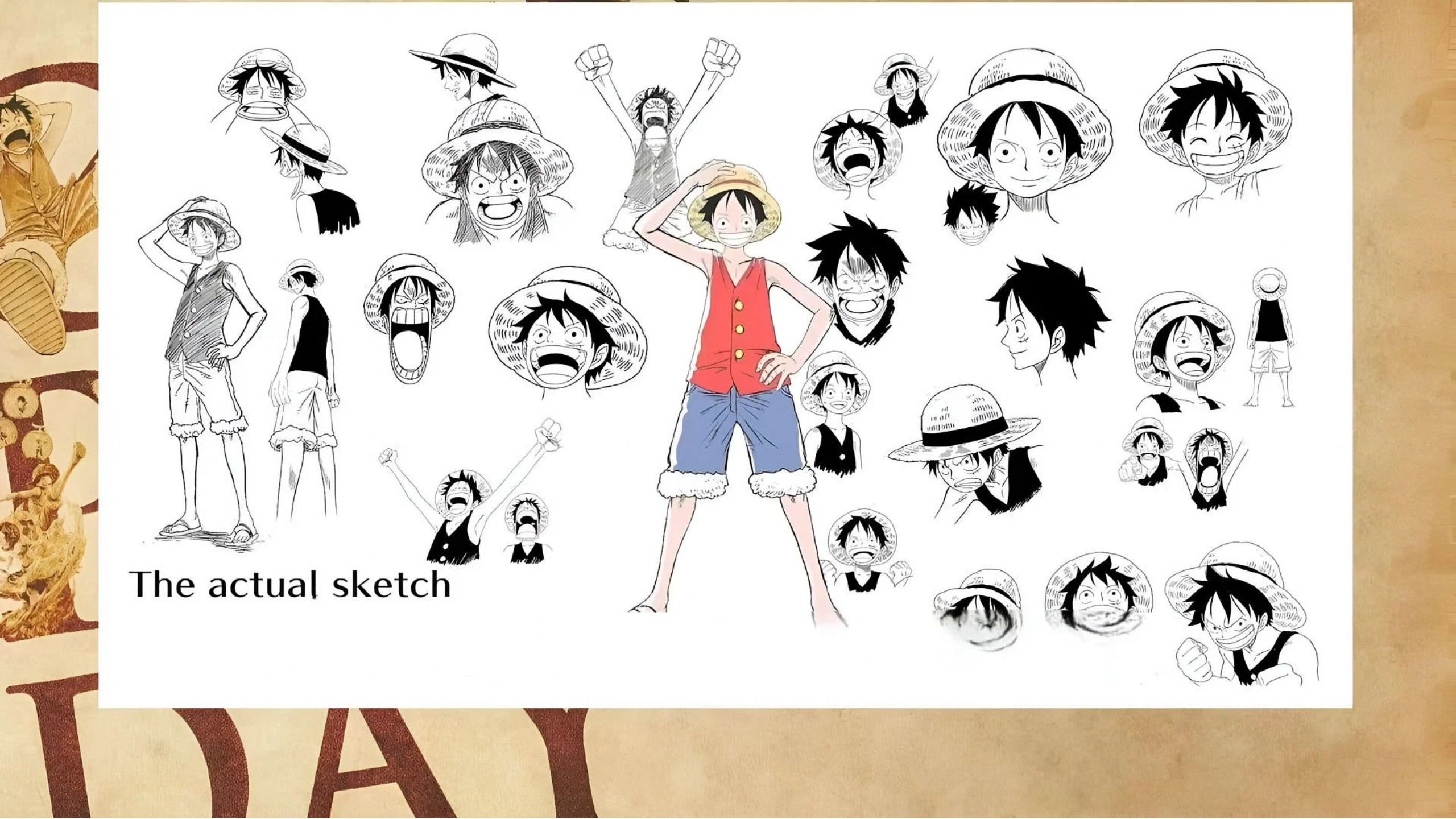
This could be seen as a reflection of Luffy’s growth as a leader and his increasing responsibilities as the captain of the Straw Hat Pirates.
The brighter colors and cleaner lines in his design might also symbolize his unyielding determination and optimism, traits that have defined his character throughout the series.
The Subtle Yet Significant Changes in Zoro and Sanji’s Designs
Roronoa Zoro’s design in the remake is another example of Wit Studio’s attention to detail.
The brighter color palette used for Zoro not only makes him stand out visually but also serves to enhance his already formidable presence.
Zoro is known for his stoic demeanor and unwavering loyalty to Luffy, and the brighter design might be a subtle nod to his role as the crew’s second-in-command.
The increased vibrancy could also symbolize Zoro’s inner strength and resolve, qualities that have made him a fan favorite.
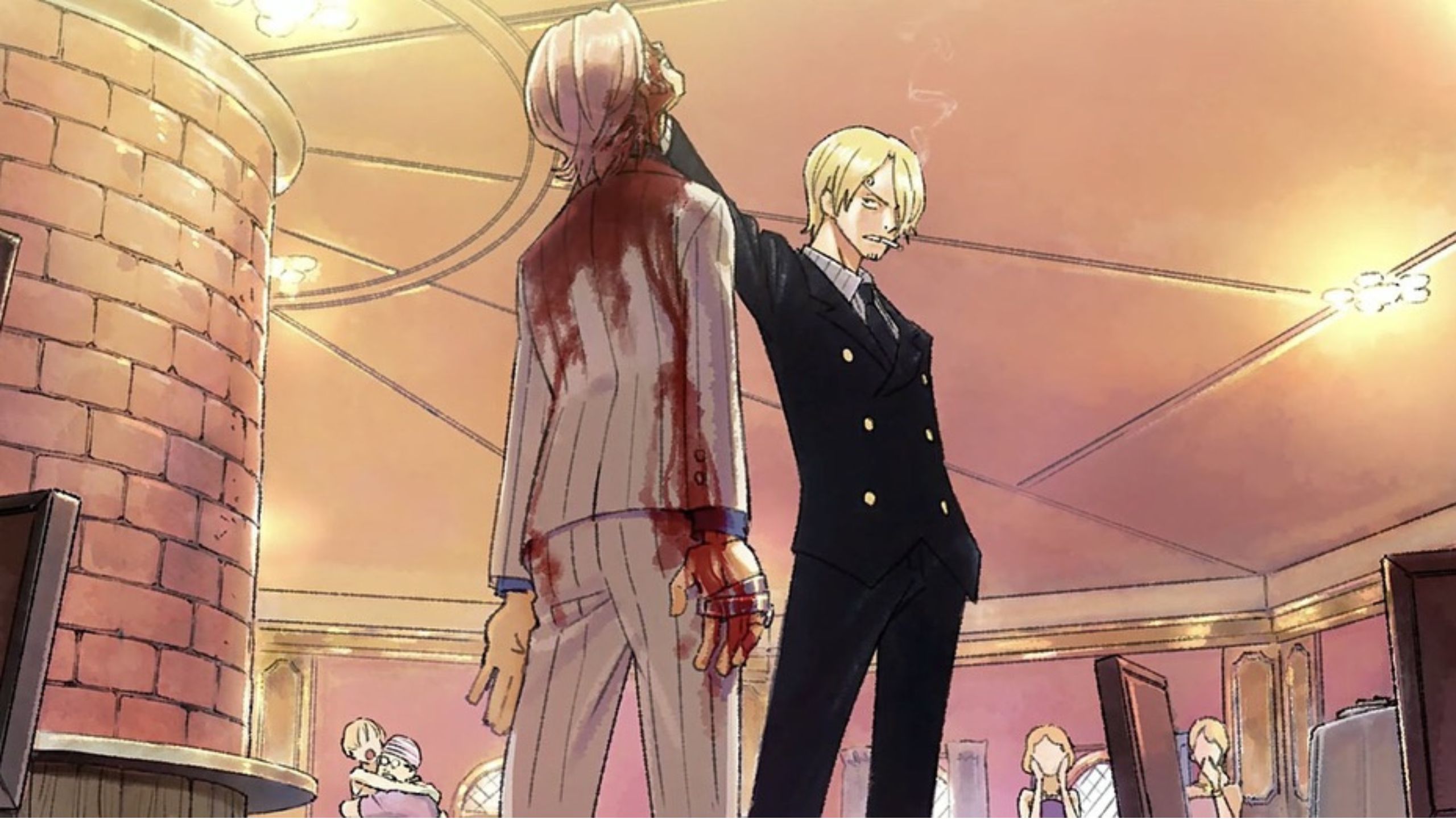
Sanji’s design, on the other hand, has been cleaned up significantly. The most noticeable change is the increased emphasis on his curly eyebrows, a signature feature that has always been a part of his character.
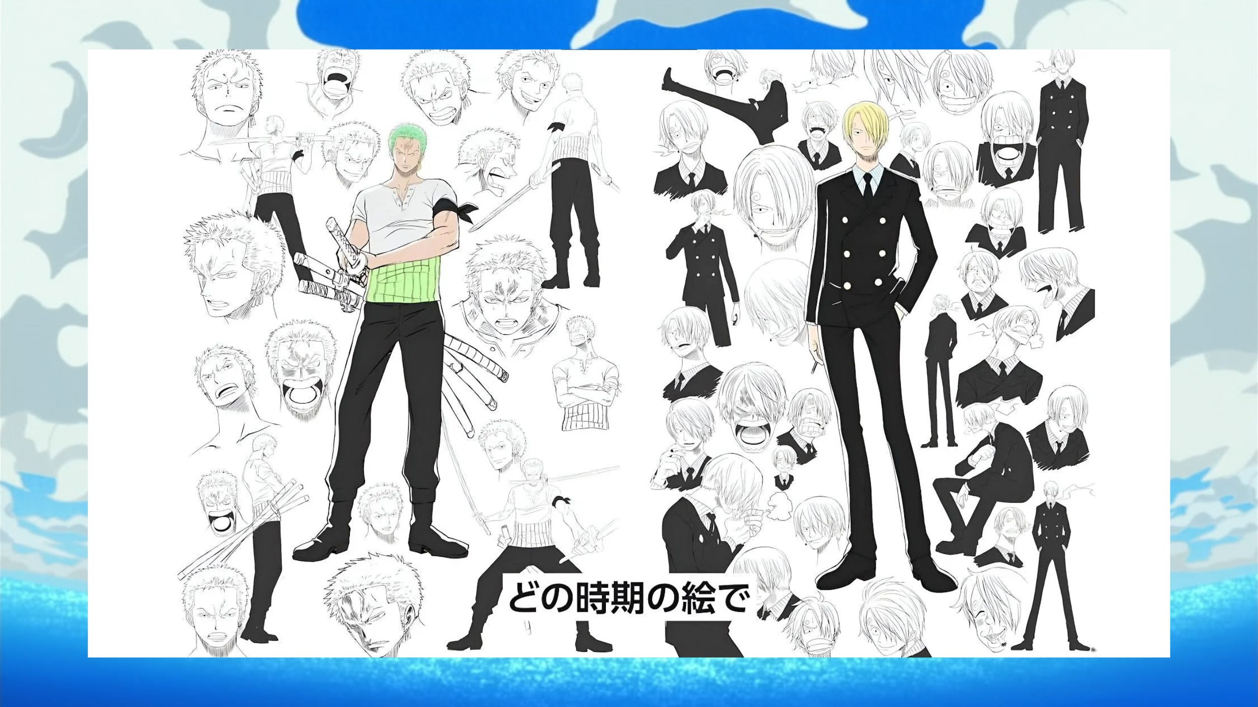
The cleaner lines and sharper details in Sanji’s design make his features more defined, which might be a deliberate choice to highlight his dual nature as both a skilled fighter and a refined gentleman.
The decision to make his eyebrows more prominent could also be seen as a playful nod to the long-running jokes about Sanji’s appearance in the series.
Nami and Usopp: The Most Transformed Straw Hats
Nami and Usopp’s designs in the remake arguably exhibit the most significant changes compared to the original anime.
Nami’s design has been softened considerably, with smoother facial features that give her a more feminine and approachable appearance.
This change has been interpreted in various ways by fans. Some view it as a welcome return to Nami’s pre-time skip design, which many fans found endearing.
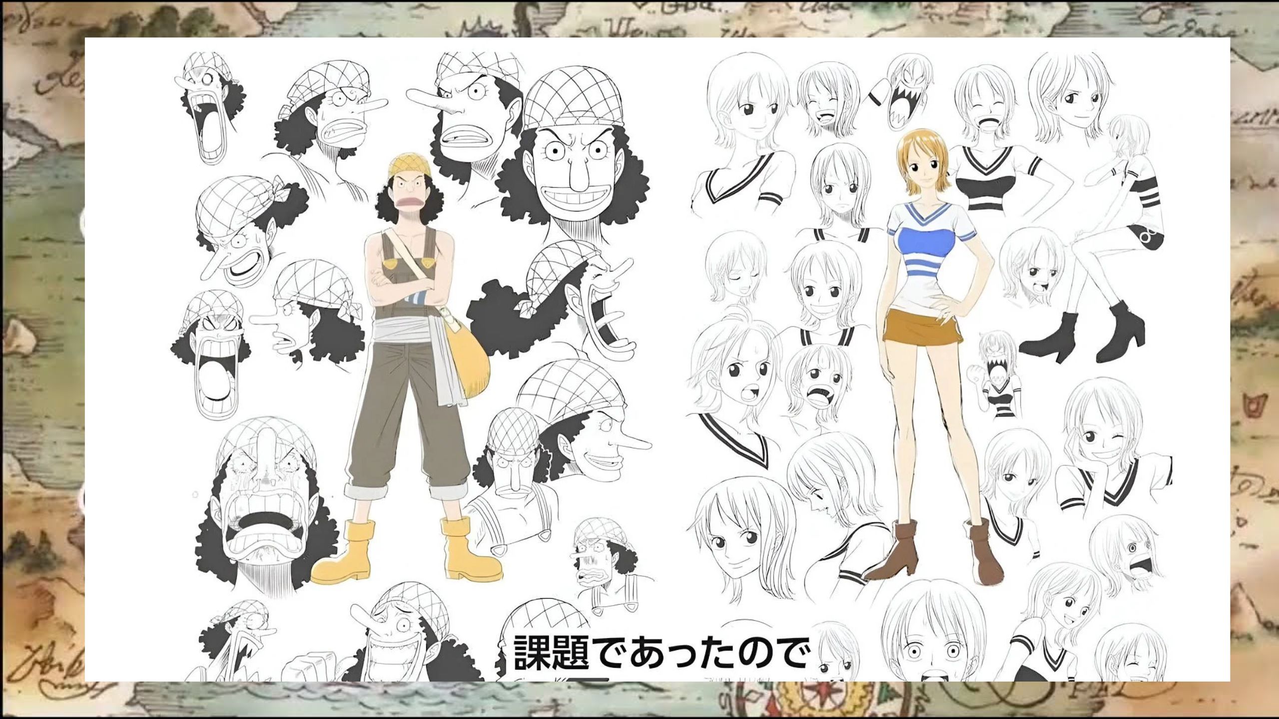
Others, however, miss the more assertive and independent look that Toei’s version conveyed. Usopp’s design in the remake is also notably different, particularly in terms of color.
Wit Studio has opted for a much lighter shade for Usopp’s skin, which contrasts with the darker tones used in the original anime.
This change could be attributed to Wit Studio’s final preference for a softer color palette, but it also raises questions about how Usopp’s character will be portrayed in the remake.
Usopp is known for his humor and cowardice, but also for his surprising moments of bravery.
The lighter colors might be an attempt to emphasize the more light-hearted aspects of his character, though it remains to be seen how fans will react to this new look.
The Challenge of Staying True to the Source Material
One of the biggest challenges in remaking a beloved series like *One Piece* is finding the right balance between innovation and staying true to the source material.
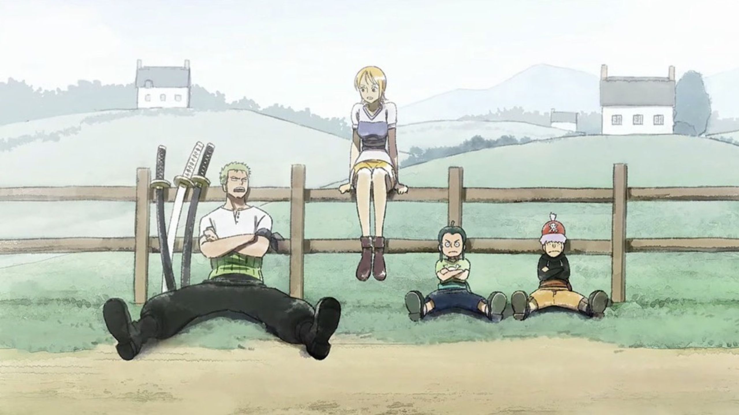
Wit Studio’s approach to the character designs reflects this challenge. On one hand, they have introduced new elements and stylistic choices that give the characters a fresh look.
On the other hand, they have made a conscious effort to retain the essence of the original designs. Kyoji Asano’s admission that his initial designs were met with criticism underscores the difficulty of this task.
The need to resubmit the designs indicates that the creative team was keenly aware of the importance of getting the characters right.
Fans of “One Piece” have a deep attachment to the characters, and any significant deviations from the original designs could be met with resistance.
However, the fact that Wit Studio was willing to revise the designs also suggests a commitment to collaboration and feedback.
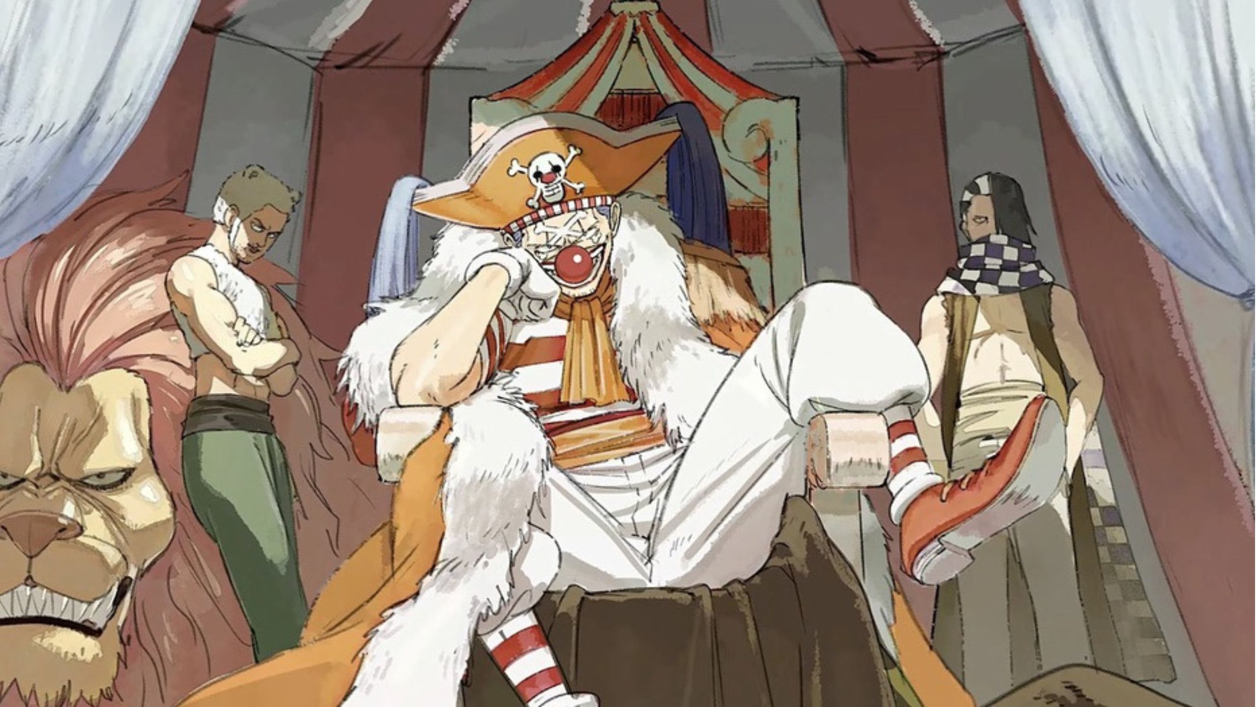
This willingness to listen to criticism and make adjustments is a positive sign for the future of the remake.
It shows that the studio is not just focused on putting their own stamp on the series but is also mindful of the expectations and preferences of the fanbase.
Comparing Wit Studio’s Approach to MAPPA’s Work on Attack on Titan
To better understand Wit Studio’s approach to the *One Piece* remake, it might be helpful to compare it to their work on the first three seasons of “Attack on Titan”.
In those seasons, Wit Studio’s character designs were known for their brightness and youthful appearance, which contrasted sharply with the darker and more mature designs that MAPPA introduced in the final season.
This contrast between Wit Studio and MAPPA could provide some insight into the studio’s goals with the “One Piece” remake.
Just as Wit Studio’s designs in “Attack on Titan” emphasized the characters’ youth and vibrancy, their designs in “One Piece” seem to be aiming for a similar effect.
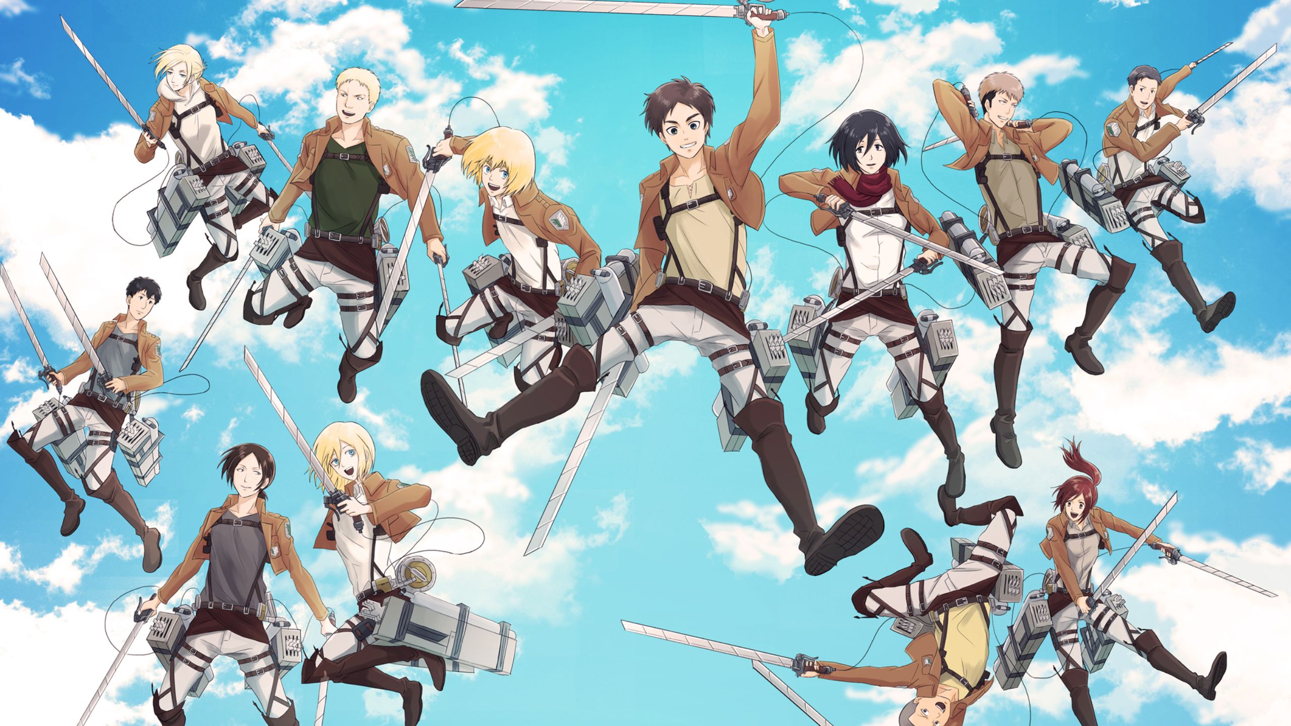
The brighter colors and softer lines give the characters a more youthful and approachable appearance, which might appeal to both new viewers and longtime fans of the series.
At the same time, the comparison to MAPPA’s work highlights the potential challenges of this approach.
While Wit Studio’s designs in “Attack on Titan” were well-received, some fans preferred the more mature look that MAPPA brought to the final season.
Similarly, there may be fans of “One Piece” who feel that the softer, brighter designs in the remake do not capture the grittier, more dynamic feel of the original anime.
A Promising Yet Challenging Endeavor
The revealing of Wit Studio’s “One Piece” remake character designs has certainly generated a lot of buzz.
The differences between these new designs and Toei Animation’s original versions are evident, but they are not so drastic as to alienate fans. Instead,
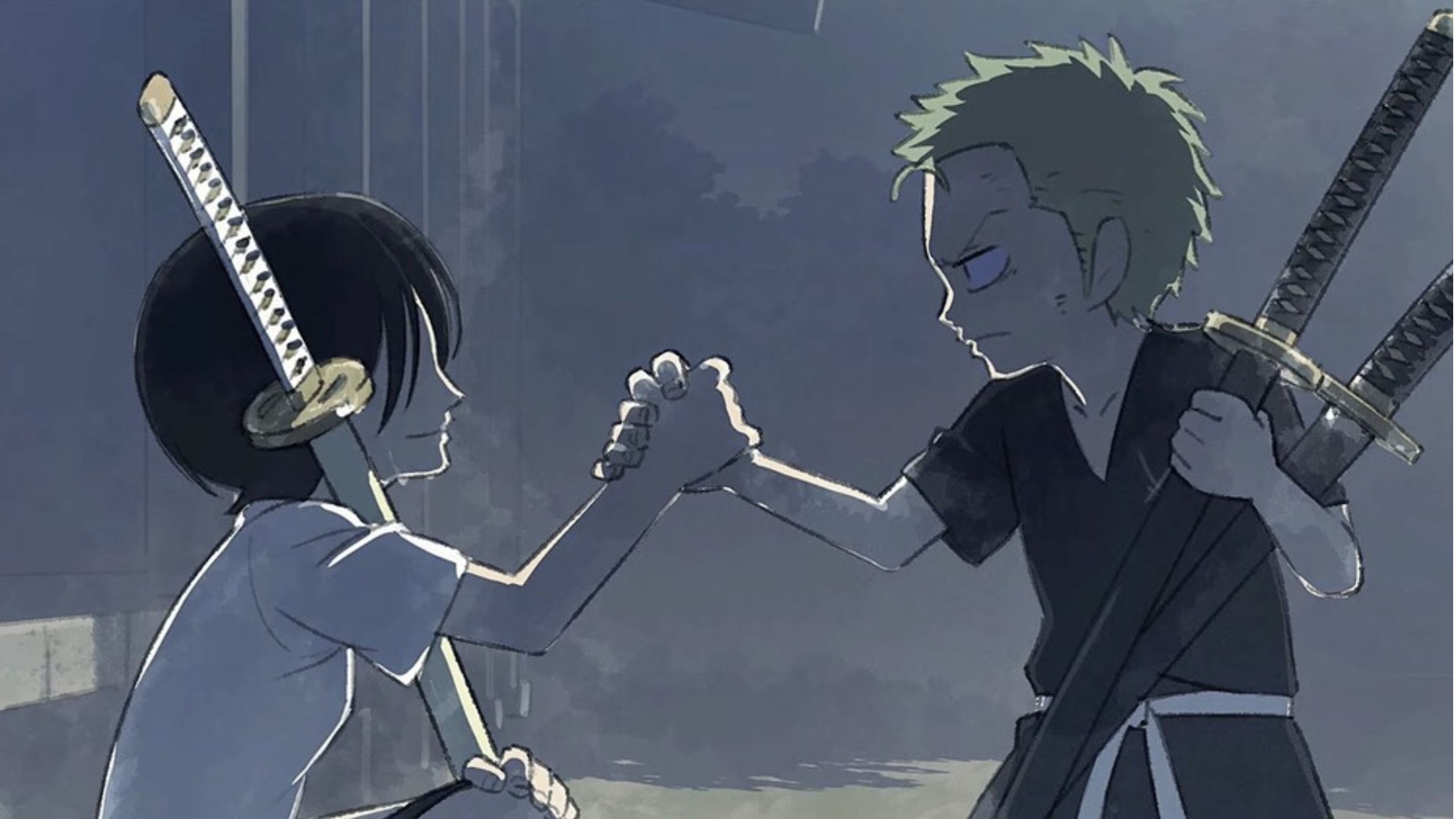
Wit Studio seems to be taking a careful, considered approach to reimagining the characters, blending their unique style with a deep respect for the source material.
The softer colors, brighter palettes, and more refined features in the remake designs are likely to appeal to a broad audience.
However, it remains to be seen how these changes will be received by the wider “One Piece” fanbase.
As with any remake, there is always a risk that some fans will prefer the original, but Wit Studio’s track record and the talent involved in the project suggest that this remake could be something special.
In the end, the success of the “One Piece” remake will depend on more than just the character designs.
The story, pacing, and final execution will all play crucial roles in determining whether this remake lives up to the legacy of the original anime.
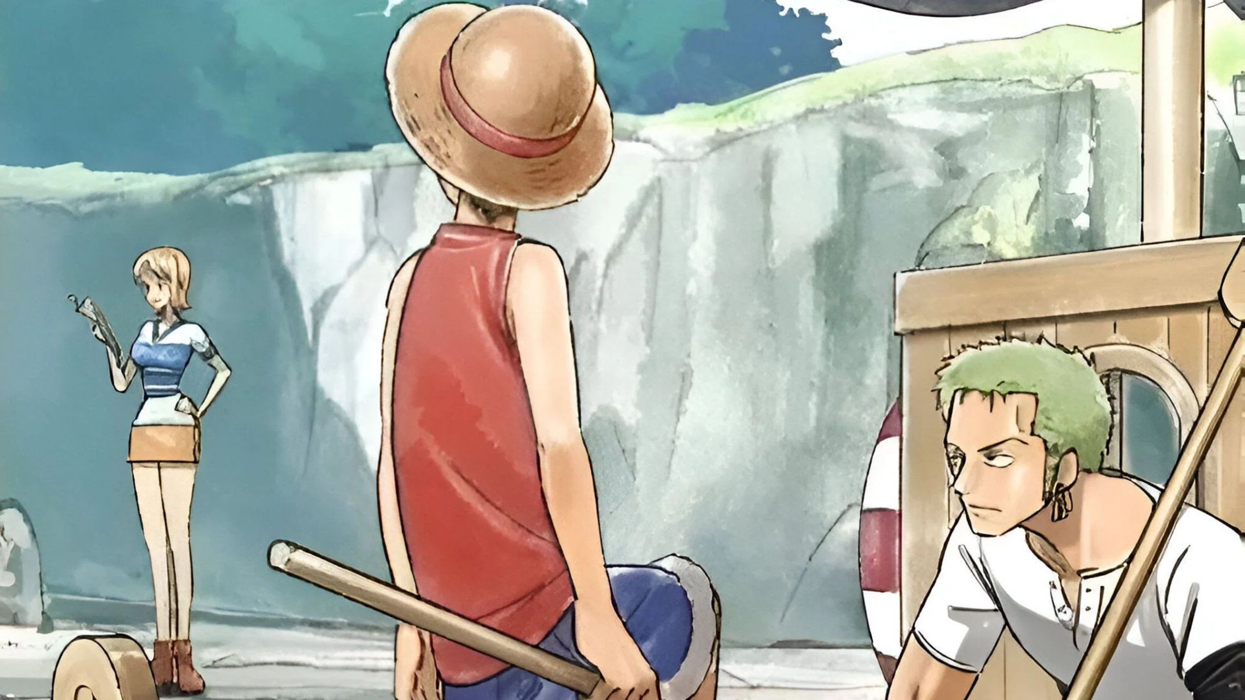
But if the character designs are any indication, Wit Studio is off to a promising start, and fans have every reason to be excited about what’s to come.
As fans eagerly await more updates and the eventual release of the remake, the comparisons between Wit Studio’s and Toei’s versions of “One Piece” will undoubtedly continue.
But whether you prefer the original or are looking forward to the remake, one thing is clear: the world of “One Piece” is about to be seen in a whole new light, and that in itself is something worth celebrating.

